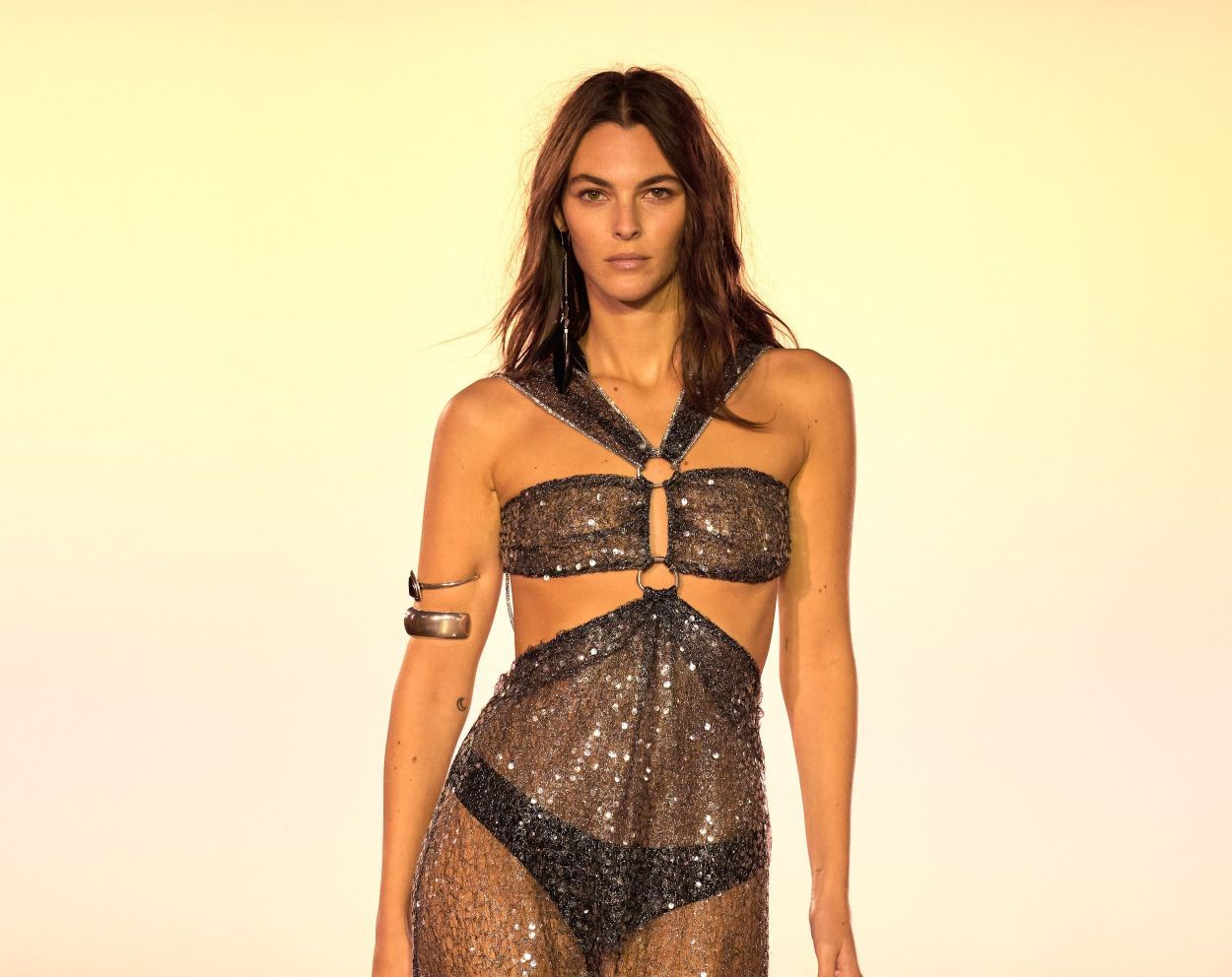
Sander Lak: The Designer Who Brought Back Colour
Oct 02, 2017

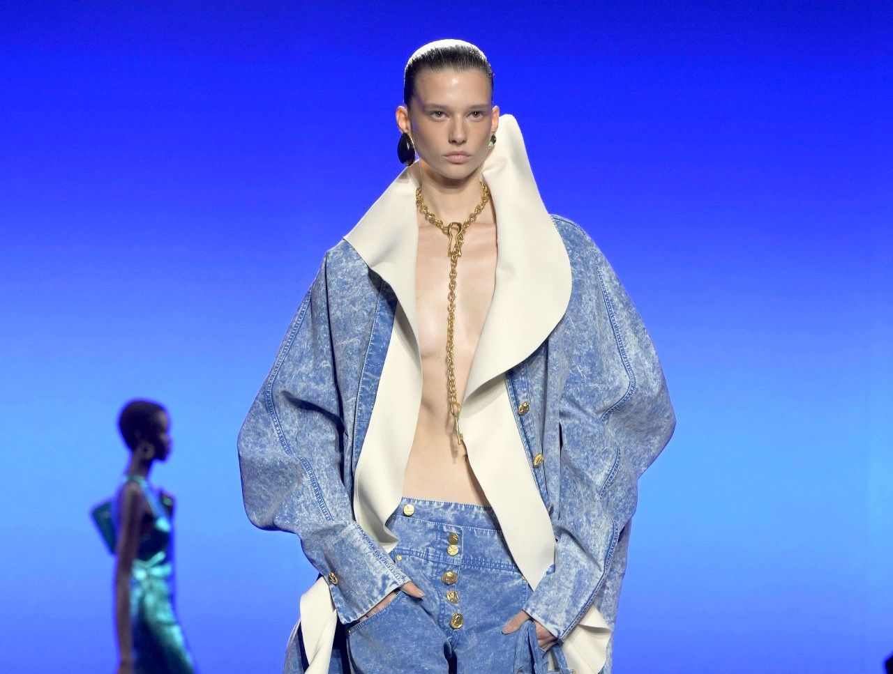
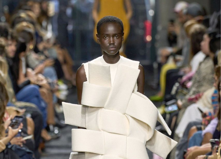
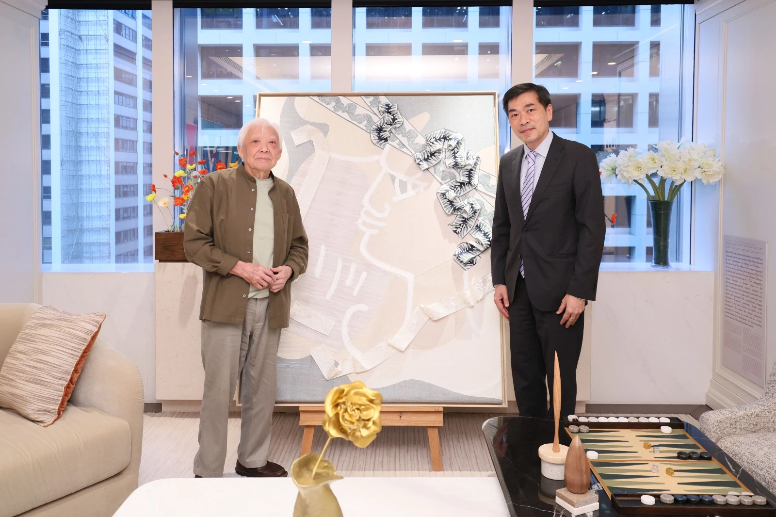
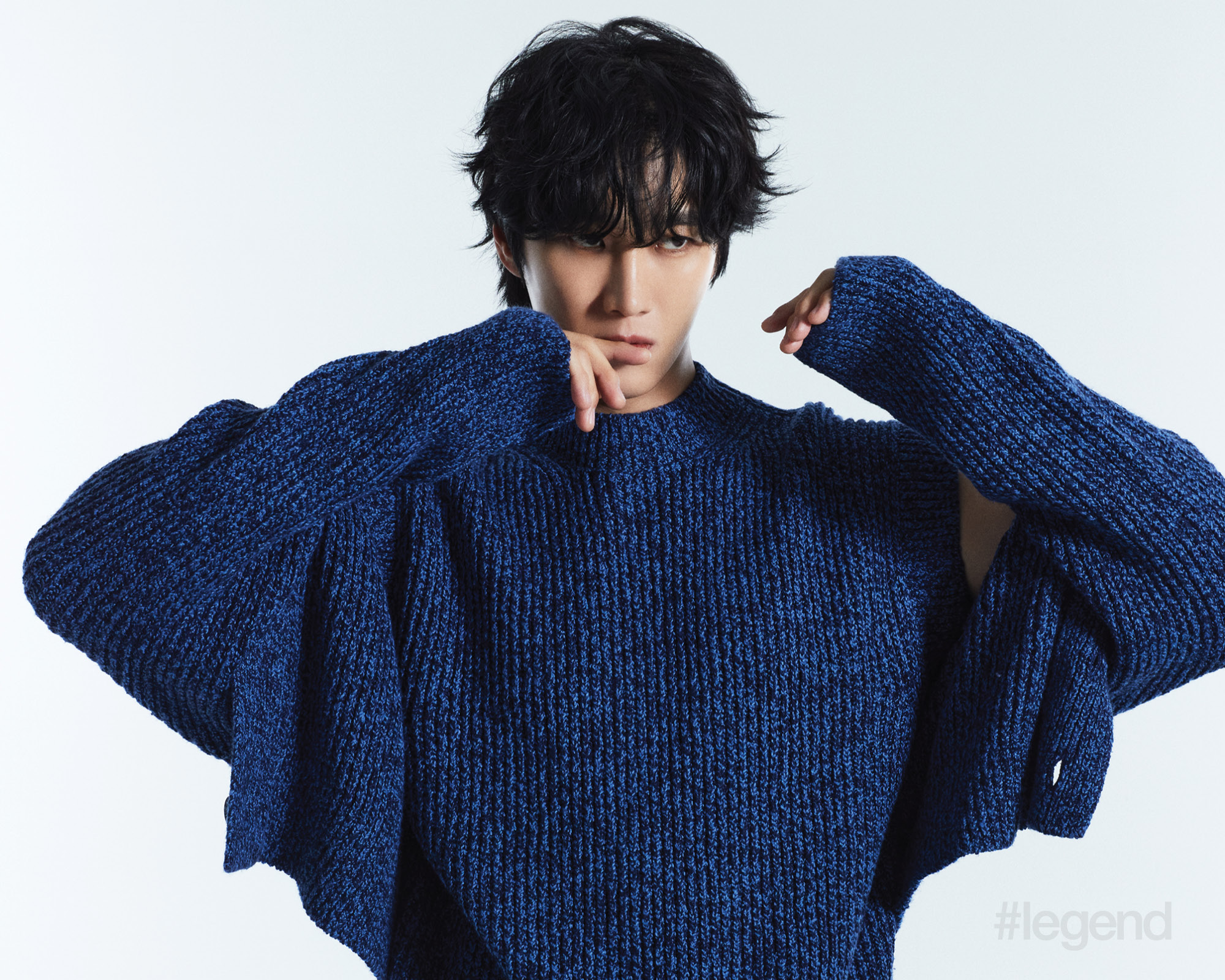
Sies Marjan creative director Sander Lak and I go back to our time working for 3.1 Phillip Lim. Lak was the menswear designer and I was the style director. He went on to found the Sies Marjan ready-to-wear label two years ago and inject some vibrant colour into an industry beguiled by black and white. The brand’s unusual name combines the names of Lak’s father and mother. While Lak is Dutch, he was brought up in the Netherlands, Gabon, Malaysia and Brunei.
We caught up at Sies Marjan headquarters in New York, where Lak had just shown his Spring 2018 collection, the label’s fourth. In Hong Kong, the brand is stocked by Joyce.
What have you been up to since we last saw each other at 3.1 Phillip Lim?
I went to Balmain after 3.1 Phillip Lim. I was brought in to launch menswear, but ended up getting involved with womenswear as well. It was an interesting time. Christophe Decarnin was there. I was there for the shoulders. It was during the Global Financial Crisis but we were selling skinny jeans with gold studs for US$12,000 like there was no tomorrow. After two years at Balmain, I moved to Antwerp to work for Dries Van Noten and I was there for five years before coming back to New York to start Sies Marjan. Phillip Lim gave me my first job and, prior to that, I had an internship at Marc Jacobs.
Read more: Designer Phillip Lim’s Next 10 Years Is All About Creativity and Fulfillment
It’s interesting that you were at Balmain; it makes me want to know your feelings about the colour black.
There is black in the collection.

Yes, but it doesn’t seem to be a big part of your creative narrative.
I don’t think it’s something I did consciously. In all of the experiences at the different creative labels, as different as their aesthetics were, black and navy were the two colour constants that we had to do for commercial reasons. I was happy to be in a position to be able to say, “Well, this is not what we are doing. We will do everything but those colours.”
The funny thing is, the customers who come into our showroom gravitate to colours that aren’t black. I have to say, this is the first season I was able to see the colour value of navy and black, and I was inspired to use it in the collection. It was nice to be able to see it as I would a pink or a yellow, and use it in the same way. It could now have the same impact as a gold. I guess it was a process that I had to go through.
You’re responsible for the celebration of colour that’s happening everywhere: the bright colours, the monochromatic dressing.
I’m sure that I’m not supposed to agree to that, but I definitely see more colour, especially in New York.
Well, I’m saying it for you: black feels tired.
The funny thing is that it wasn’t my intention. Colour was just something that I wanted to do. I believe in consistency and message. It’s important, especially now, when people are consuming so many images and so much information. There’s a consistency that we’ve had since season one and that is colour.

That was deliberate?
Yes, it was. I feel this is the way it has to work. Fashion was different before, in that it was smaller and there were only three or four channels. Now it’s become such a ginormous thing. If you aren’t somewhat consistent, people won’t know who you are. The identity has to be made very clear.
Did you face challenges, commercially, in having a clear vision without historical data for buyers?
Even in the first round, the customers were safe with their selections. They became a lot more comfortable when they saw it again for the second or third time. It was a bit of a discussion with the commercial team at first, but I always reference my mother or my friends who don’t work in fashion and won’t get bored with things in five minutes. The customer needs time to see our consistency and our confidence in what we’re doing as a brand. But, yes, it was interesting, clicking through the collections from this season and the last: a lot of colour and monochromatic looks. The challenge will be to see what we do next.
I really enjoyed your ready-to-wear spring show; such an interesting decision to host it in your office. What led you to that decision?
Last season it was at the New York Midtown Hilton, which was clinical, New America, a bit of a Las Vegas feel. It was super-corporate and meant to look like a ballroom. That space was really fitting for that collection, which was about the rejection of irony and the idea of taste. After that experience, I wanted to go in the opposite direction and head somewhere else. I kept thinking about the concepts of home and warmth. What did these things mean to me? I thought about the people in the office and how they are my extended family. I wanted to seat everyone in the office, to put everyone where we are, so they could see the collection in its home and where the pieces were born, with the good and the bad, the mess and the prettiness. Let’s not clean anything up, let’s not do a perfectly polished version, but show that this is a place where we do what we love.

Since you put yourself out there for this show, what has been the reaction to that honesty?
It caused a personal reaction for some, that was the immediate feedback shared with me after the show. I just thought it was important. The industry is disconnected from what it takes to make these beautiful garments. It has become so much about the show. I believe luxury has lost some of its identity because of this. At its heart is beautiful product, and the process and the people that are a part of its creation.
It’s interesting that you’ve established a language so early on for your clothes. I’ve had conversations with designers who feel the most difficult pieces are the simple things. Would you agree?
I come from a menswear background, which has clear boundaries; one button can be too many. I’ve been trained this way. It’s relatively easy for me to not overdesign because I can quickly feel like something is too much. Also, we don’t design with themes. The Dutch have an expression, “Just be normal; you’re already weird enough.” Although I’m Dutch by heritage, I haven’t spent much time in Holland. This expression really resonated with me in design. Let it be a garment. Let the fabric, the colour and the fit speak volumes.
You switched stylists last season. Are you working with Marie Chaix?
Yes. She’s great; so chic. I think a good stylist can keep the language of the brand and make it its best. We’re more design-driven than styling-driven. What we show is what we sell. When it’s too styled, it can lose the essence of what we’re trying to sell. For some brands, it’s the image that needs to sell. Not us. We don’t have toys or T-shirts to sell. Product, design and image: the balance is both interesting and challenging. Creating something that has an exciting fashion feeling and is transformative but also inspires people to want to buy it isn’t easy. We try to find the balance. It’s a process and we do everything from the gut. I believe it’s this instinct that keeps the product from looking like anything else on the market.

Cool versus pretty; pick one.
Can I choose “pretty cool”? How about “awkward”? It’s hard to deny the instinctive feeling of something pretty.
You had a lot of toes tapping at the show. Who did the music?
Michel Gaubert. It’s funny because at the beginning I sent him all of these pretentious intellectual references. When it got closer to the date, I had a change of heart. I thought, I can’t be bothered, I just want to listen to Madonna, Michael Jackson and Wham!, and have some fun. There’s enough going on outside of our industry, so it was a celebration of what we do because we love what we do.
I’m happy you went with your gut feeling.
I just can’t not be me.
This article first appeared in the October 2017 print issue of #legend magazine.


