#legendasks: Jean-Michel Gathy shares the beauty of Aman New York
Oct 10, 2022
Luxury hotel design veteran Jean-Michel Gathy has completed his 11th Aman property at Manhattan’s iconic Crown Building. He tells Zaneta Cheng about the similarities between hotels and cars, the beauty of geometry and how Aman New York is an oasis of calm

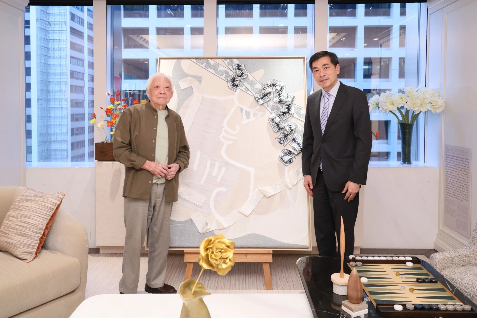
Jean-Michel Gathy knows a thing or two about luxury hospitality because he’s been designing resorts and hotels that most only dream of for four decades. A Belgian national whose design firm Denniston is based in Kuala Lumpur, Gathy had designed ten Aman resorts before adding the newly opened Aman New York to his list. Gutting and redesigning the hotel across the fourth to 26th floors of the city’s storied Crown Building, Gathy applied the geometric lines and proportions he is known for, giving the vertical space the same feeling as the more horizontal resorts that Aman has within its portfolio.
At Aman New York, you’ve designed many areas that allow guests to experience a one-of-a-kind Asian-inspired retreat in the heart of Manhattan. How did you conceive the design for these spaces and give them a common design identity while making sure each one was unique?
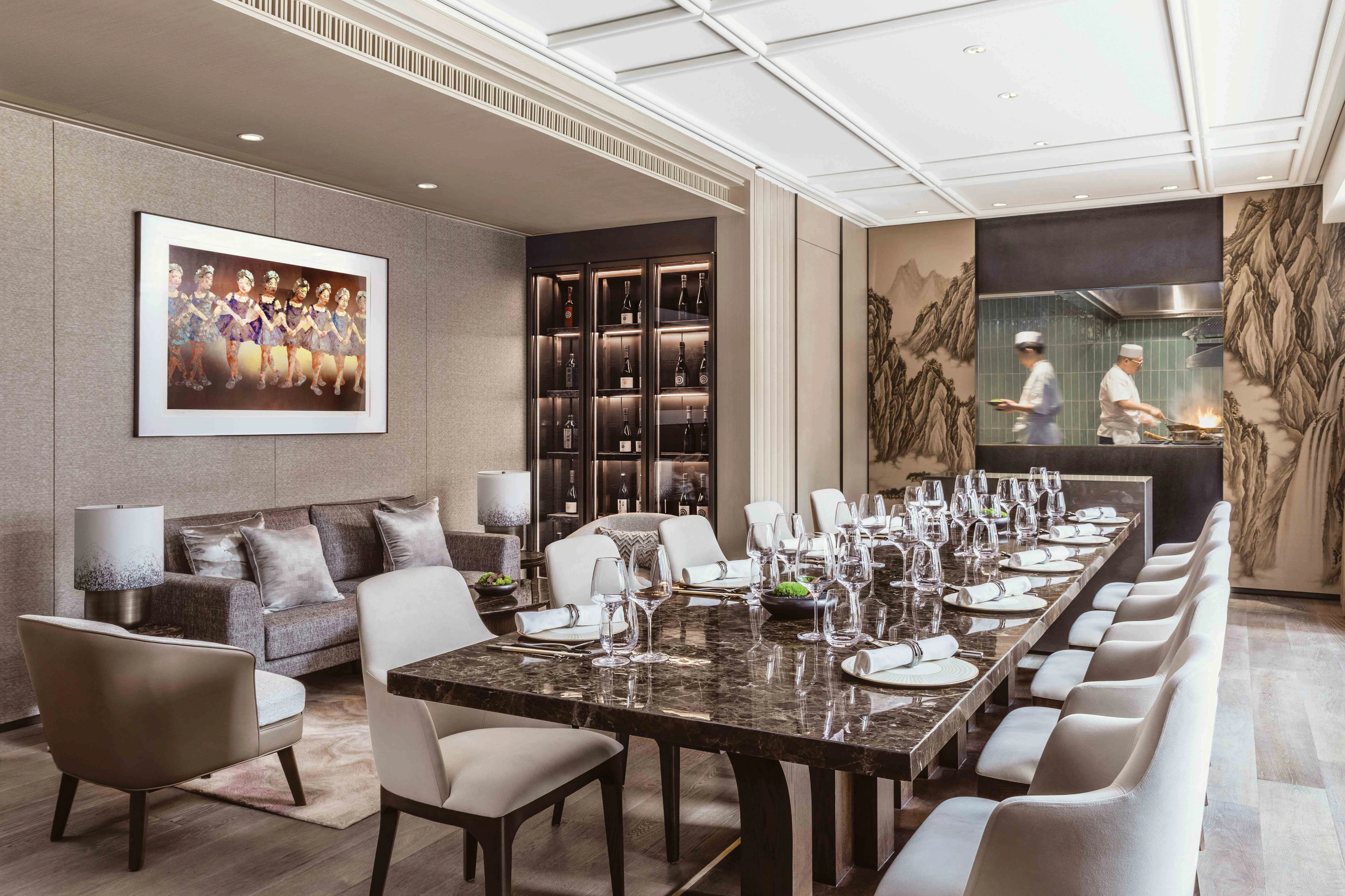
This is very simple. Let me share the example of BMW: the M2, M3, M4, M5, the 7 Series and the 8 Series. They are all BMWs and look alike, but they have different engines, different stability systems, different interiors, and different seats, some of them are coupes, and some are not. This is the same for design. You keep within the same line, same proportion and same philosophy, but you give different facilities – whether it’s the swimming pool or treatment room, they are both equipped with a fireplace. The travellers can still experience peacefulness and have an exceptionally good level of acoustics.

You’ve mentioned how Aman gives you the creativity to be yourself. This time, as the designer of Aman New York, what sort of new experience did you develop and how did the city influence your initial mood board and subsequent design decisions?
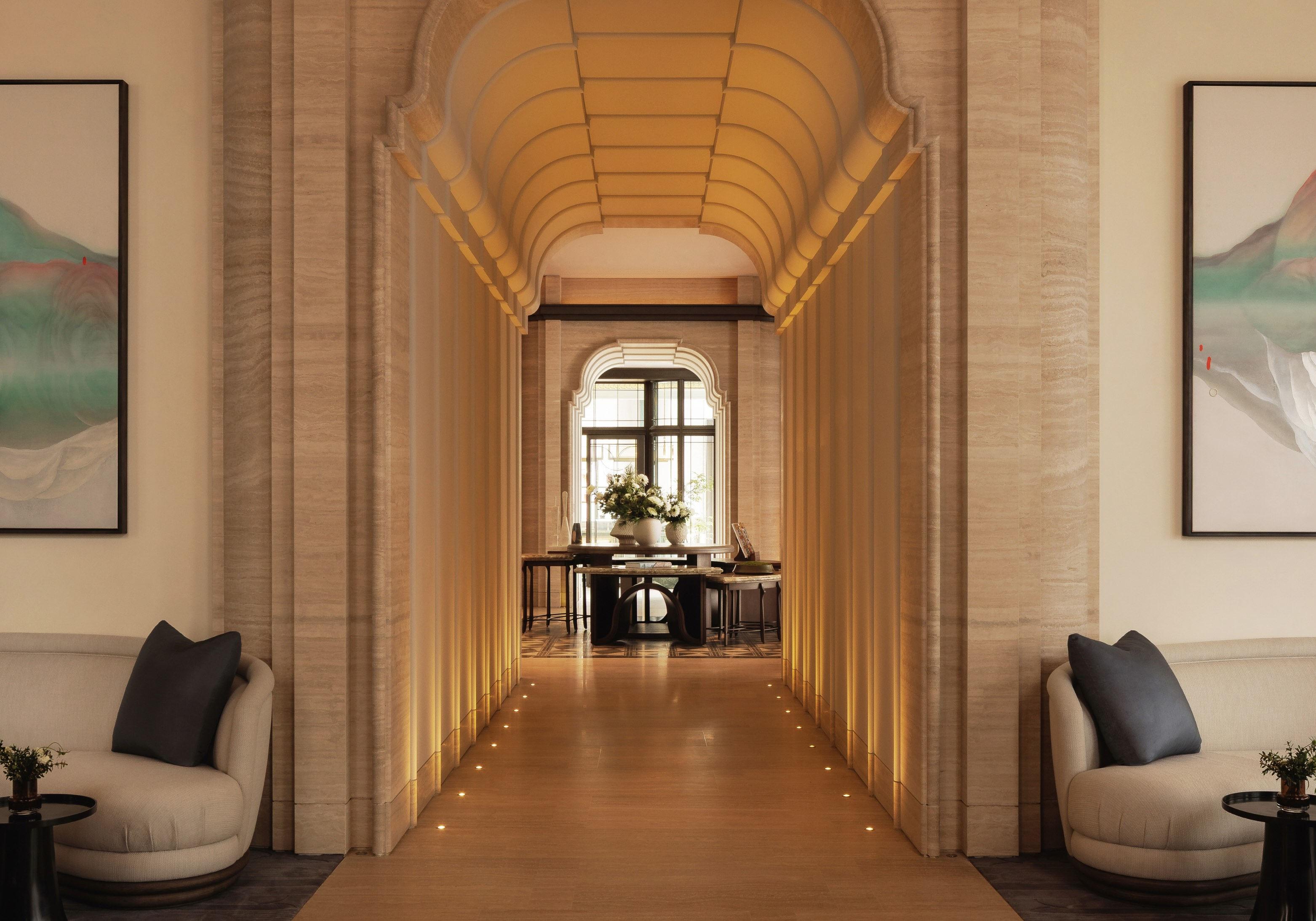
Respecting the Crown Building’s storied heritage was key to the design process from the very outset. Embodying the splendour of America’s Gilded Age, the building was designed by Warren & Wetmore, the influential architects of Grand Central Station and the Helmsley Building. All this history was sensitively considered as Aman and Denniston undertook the building’s restoration and epic conversion. Using a period approach, the building’s palatial proportions were retained via spectacular double-volume public areas, but with Denniston’s trademark creation of spaces within spaces to create intimacy despite the grandeur. Discreet gold details, paired with Aman’s signature muted tones, throughout the interiors hint at the gilded pinnacle reaching for the sky – a beacon that has stood for progress and the timeless dynamism of Manhattan for over a century.
Aman hotels are usually known for their expansive open spaces. How do you incorporate that design signature into a skyscraper?
We are obviously challenged by space. Aman is designed in such a way that you feel that the space is large from a psychological perspective. If you look at all the Aman around the world, none of them is opulent in their space. They are well designed in the sense that we emphasise volume and space. When the space is in a smaller volume, the way of design will play magic to make it feel big. But we believe that what makes Aman famous is the human scale and that is what we have in New York. A home is a place where you feel comfortable, and that’s what makes Aman successful. The spaces are not large, but they are well [thought out].
What we have done in Aman New York is create transparency between the inside and outside on the 14th floor. Aman New York has a very large terrace, and most of the area on the 14th floor is an open terrace. Even though the space inside is relatively restricted by the building and vertical axis, it’s still spacious and well-connected to the outside, which creates a sense of generosity.
Also see: Escape to these 4 luxury destinations for an unforgettable winter adventure
When you were first asked to design for Aman New York, what were your initial thoughts and plans and were you able to achieve them in the end?
I was quite impressed when I first visited the Crown Building. The building is extremely well-located and extremely attractive in terms of volume. It is actually a beautiful building and façade, but the inside was not impressive in the sense that it was full of offices. I knew that they would be replaced by the hotel. I then immediately thought of how I was going to bring the DNA of Aman into this building, which is in New York.
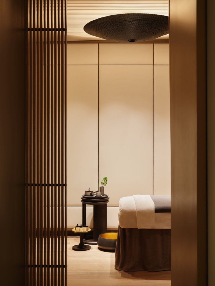
Aman New York still retains elements of Asian influence. What elements of the vast continent of Asia did you choose your inspiration from and why did you choose them for this specific project and space?
In a nod to the brand’s roots, each suite features a large-scale art mural inspired by the 15th-century masterpiece Pine Trees (Shōrin- zu byōbu) by Hasegawa Tōhaku and now owned by the Tokyo National Museum. One of Japan’s most celebrated works, it was designated as a National Treasure in 1952 and is internationally acclaimed. The piece perfectly captures its eminent pre-Edo influence and is a homage to Tōhaku, printed on delicate rice paper and spanning the walls as a captivating focal point.
You’ve said that architecture is about emotion. What were your emotions for this project? And when a guest first walks into Aman New York, what type of emotions do you want them to feel?
I think it’s clear that the whole idea of having Aman New York at the corner of Fifth Ave and 57th Street is to create a haven of peace. You will need a place after your day, and you need a place of calm. That is what Aman New York is: a sheltered harbour, a place where the boat can relax and repair while staff can finally dine properly and rest calmly. And how we do it lies in the acoustics, materials, design, a process of dynamic circulation and colours. They are all the tricks of the architect.

What did you find was the most interesting aspect when you were designing for the transformation of the iconic Crown Building in New York, and what were some of the challenges you came across?
We had two fundamental challenges. The building is an existing building. It couldn’t be demolished, only renovated. And it was originally an office building that was designed to be maximised. Therefore, the elevators and escape routes were specific in order to maximise this space. But the hotel is totally different, and so the location of the lift on each floor is a big challenge for us. When you design a hotel, you must make sure it matches the windows and ensure the windows are well planned in the bedroom as well as its location. We call that the fenestration on the façade. The location of the lift cable also created a major problem for us to solve in terms of planning.
As an architect/designer/landscaper, what would you say is your design approach and philosophy, especially for luxury hospitality properties?
I am structured, guided and honed by my background and where I live. I had a classic European education, but I lived in Asia for 42 years, so I’ve been impregnated unconsciously and consciously by Asian values and the Asian philosophy of life. But my fundamental philosophy is geometry and comfort.
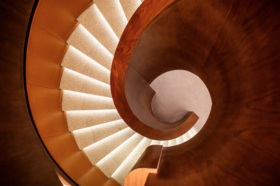
I like geometry, but I don’t mean necessarily symmetry. Symmetry is a form of geometry, but geometry is the concept of associating spaces, volumes and circulation following a certain logic – this is my European mentality. And for me, a hotel in the luxury sector must be comfortable. It is what has people coming back.
Also see: Urayama: Plants on display in Yangming Mountain
What was a formative experience that inspired you to become an architect?
When you are a child, you are unconsciously influenced by your education. My parents were educated people who noticed my love for geography and reading about buildings, forts, museums, and everything. When I was nine years old, my father told me that we were going to Italy for a holiday and asked me to organise a trip that would visit interesting monuments on the way. There was no GPS, telephone or any system in 1964, so I had to study the map. I spent a lot of time studying the roads and figuring out which church or museums we should visit, and exploring the special topography or scenery that we were going to encounter. I organised the whole journey, and I discovered that I don’t only love travelling, but also architectural designs and scenery. This experience finally led me to direct myself to architectural school.
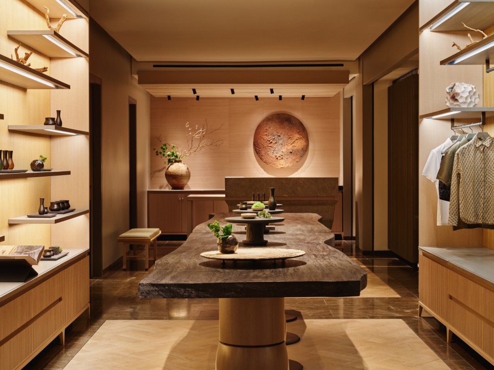
You’ve said that patience is key to establishing one’s credibility as a designer. How would you say your style has changed from when you started until now, and what were some of the creative roadblocks that you learned from and overcame?
Patience is not necessarily the right word. I think time is the keyword – you have to learn and go through the process. For example, when you play tennis, you do not become a great tennis player in one day. Even though you might be extremely talented, you need to build muscles, stability, and confidence and progressively develop your skill. No one will be given an opportunity to work on a top-class project unless he or she has proven himself or herself.
As a Belgian who’s been based in Asia for almost four decades, what do you enjoy the most when working in Asia? What led you to want to base Denniston in Kuala Lumpur?
I love the food, culture and lifestyle in Asia. I’ve been living in Asia for more than 42 years and have stayed in Hong Kong for 11 years. I am highly adapted to the lifestyle and culture in Asia and am really enjoying my life here.
Another reason is that it leaves room for creativity. Asia is layered, the culture is layered, the architecture is layered, and the way of living is layered, whereas, in Europe, it is much more controlled and policed. People think you have more freedom in Europe, but not at all, and in my opinion, that goes against natural expression. In Asia, however, people are much more forgiving. They know when you have a sense of humour, and they understand that it is a joke. I love that.
Photos courtesy of Aman New York
Also see: Seoul International Drama Awards 2022: list of winners


