Interior Design Kelly Wearstler on how to curate a stylish home
Oct 19, 2021
Online luxury fashion destination Net-a-Porter has teamed up with Kelly Wearstler to create a vibrant lifestyle collection. The California-based designer talks about the new accessories range, her latest hotel project and advice for Hongkongers trying their hand at interior décor

Five books, countless clients, a television show, retail stores and a masterclass are only some of the credentials Kelly Wearstler has to show for her 30 years of experience in the design world. This year alone, she’s created a paint palette for Farrow & Ball and created a new furniture and décor line, not to mention overseeing several notable interior design projects. Now, she’s taking a foray into online luxury with Net-a-Porter. The collection brings Wearstler’s iconic Californian maximalism to the retail site’s high-end international clientele.
“The upcoming lifestyle collection for Net-a-Porter is a capsule of home accessories – vases, jewellery boxes and catch-alls – designed to elevate the everyday,” Wearstler explains. “The collection is enriched by a diversity and juxtaposition of materials, from vintage crystal glass and solid architectural brass to marble and poured concrete.”
While this is not the first time Wearstler has designed a capsule collection, she’s best known for curating and decorating residential spaces, not furnishing them herself. Asked about branching out into this new field, she says, “Designing accessories and products is an evolution of my interior design. I believe interior design is all-embracing from spatial organisation to the very tiny details, like a jewellery box, so that there’s a cohesiveness to the whole. Every detail should be special and significant in its own right.”
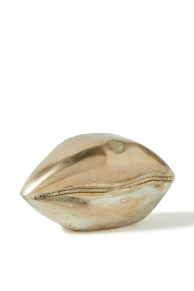
Wearstler has certainly embraced this new extension of her career, filling the nine-piece collection with diverse textures and colour combinations that show exactly why she’s the poster child for West Coast maximalism. With minimalist design becoming the norm in recent years, her Little Kiss lip-inspired ornaments and eccentrically shaped bowls are a breath of fresh, uninhibited air.
Libby Page, senior fashion market editor for Net-a-Porter, says, “Kelly Wearstler’s pieces are incredibly luxurious and elevated. They take inspiration from history, but she adds her own modern twist to bring them into the present. Each piece looks like a work of art; it’s an understated luxury.”

Antique accents throughout the collection add a timeless feeling to the objects. Wearstler has always harnessed the old to make modern design more classic. Her fascination with antiquity likely stems from her mother, an antique dealer. “My mother took me to antique shows and auctions as a girl, educating my eye from a young age,” she says. “Interior design combines so many of my passions – architecture, art history, sculpture, pattern, texture, light and movement. It truly is my dream job.
Also see: Inside Leonardo DiCaprio’s Spanish colonial Los Feliz property
“After graduating from art school in Boston, I held a few design internships including at Milton Glaser in New York. I then moved to the West Coast and waited tables while I launched my own design business. I started out with one client. I was referred by a friend and hired to design one room in their home. I slowly grew my business by word of mouth. It was 1995 when I officially opened my studio.”
Since its founding, Wearstler’s studio has worked with a wide range of hotels, restaurants and celebrity clients. Asked how she approaches each new project, the designer answers, “Drawing inspiration from the local surroundings and environment has always been an essential part of my creative process. Every architectural structure is a direct link to its location – the culture, the history, what is literally outside the door and can be seen from the windows. My work with Proper Hotels is a good example of this process in action.”
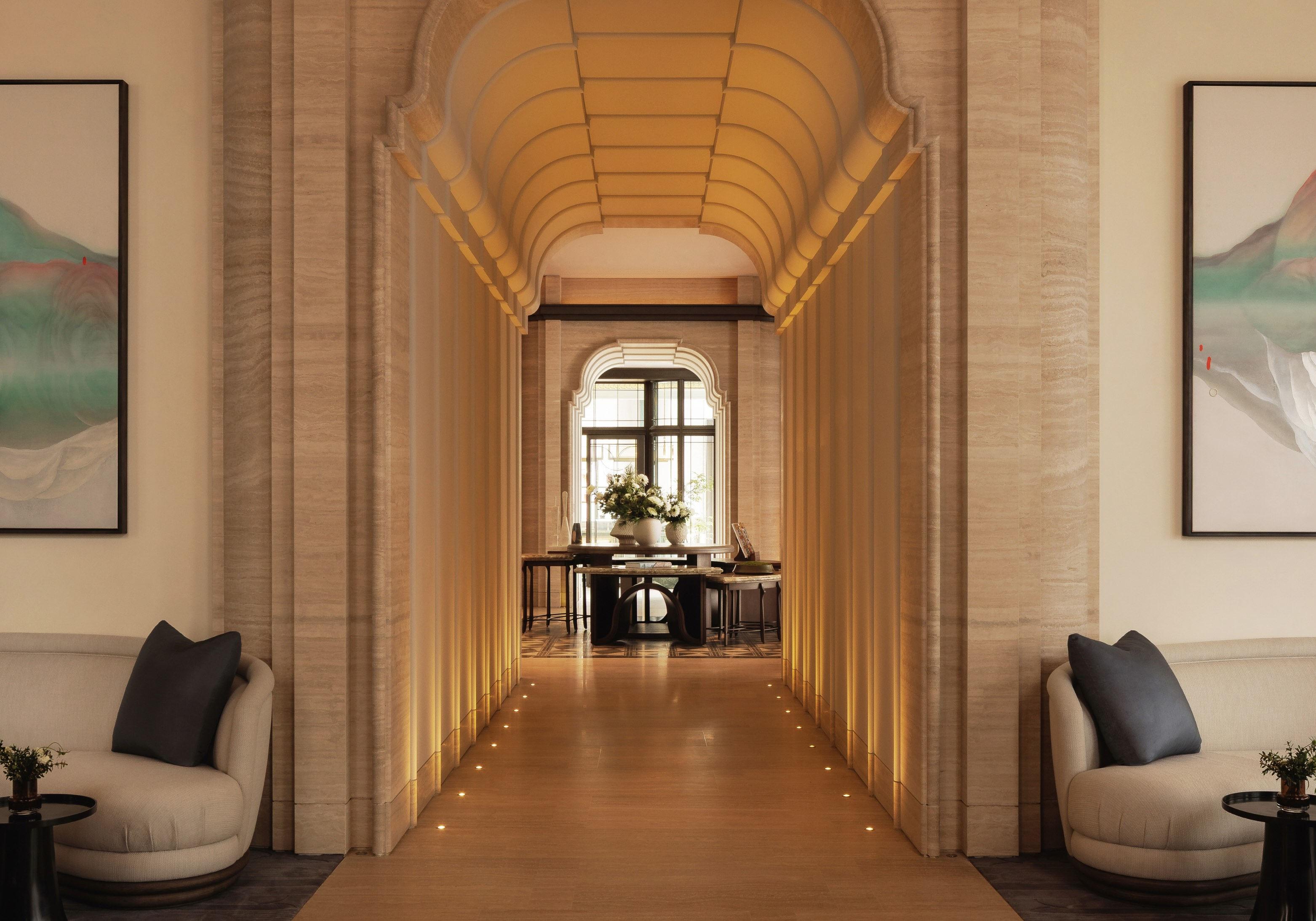
Wearstler has collaborated with Proper Hotels, a West Coast luxury hotel chain co-founded by her husband Brad Korzen, since 2015. She’s currently working on its new Downtown LA location, opening later this month. “For the Downtown LA Proper, I sought out distinctive artworks and furnishings created by local artists and artisans, and local materials, to stay true to the area’s personality and history,” she says. “The building itself is a Spanish colonial-influenced landmark red-brick [structure], dating back to 1926 – it has amazing original windows, which beam with natural light and offer views of historic thoroughfares and skyline icons. I used these views as inspiration for the interiors, creating a conversation between the outside and inside worlds.”
Outside the history of specific locations, Wearstler’s style always carries hints of contemporary LA maximalism. “California totally informs my work because it’s not rooted in tradition, so there’s always new and emerging artists,” she says. “The design styles are so vast and there are no rules. My aesthetic has always been about this mixology – the juxtaposition of contemporary and classic, raw and refined, masculine and feminine.

“Maximalism is a risk-taking aesthetic which encourages us to be bold with colour, explore a clever use of materiality and a juxtaposition of styles from a range of eras. Using colour in your home is a chance to express your personal voice within the space and alongside paint. You can also look at other objects in the room to start the story. It could be a piece of artwork, a vintage rug or even a fabric that you fell in love with. When mixing patterns and textures, try to stick to a consistent palette to link each element of the room.”
Though, for Hongkongers living in 600 sq ft apartments, maximalism may end up looking more like clutter. Wearstler advises, “Open-plan designs are a great way to release free space and create flow. Zoning with strategically placed furnishings or contrasting wall coverings can help to define areas for cooking, dining and relaxing. I always say, just because a room may be small does not mean it needs to be white or light… dark, moody tones can work beautifully to blur the boundaries of a room to make it seem larger and full of character.”
Taking into account the extended time people now spend at home, Wearstler suggests, “This is the perfect time to experiment with tactile materials and play with different textures across fabrics, upholstery and rugs to create a cosy home haven. Gnarly thick wool or silk carpets, or bouclé fabrics, will add a plush, homely touch and can make notoriously plain colours look and feel luxurious.”
For all the amateur interior designers starting out, Wearstler’s five books are a good introduction to her design philosophy. Though, she also shares with us the key commandments of interior design: “For me design is storytelling and it’s important to remember that every space has a unique and inspired narrative to tell.
“For me design is storytelling and it’s important to remember that every space has a unique and inspired narrative to tell”
Kelly Wearstler

“I think finding the place to actually start can be the most intimidating and feel overwhelming. Where the journey begins is inspiration. I always say to start with what most inspires you, what your passion point is, and allow that to be the spark that moves the design forward. It could be a piece of art, a prominent colour in your closet, an era of design, even a vintage bracelet or a lamp.
“I’m very driven by intuition in my work but also believe that you must know the rules in order to break them. A designer must always look at history in order to formulate her own aesthetic and POV. By introducing classic motifs to their contemporary counterparts, it’s possible to create a tension that engages with a rich dialogue. That’s where the magic happens.

“Colour is so powerful and can evoke so many emotions. You can completely transform the feeling or mood of a space by infusing colour, whether that’s with artwork, textiles, wall coverings or objects. Using colour is also a chance to express your voice within the space and create a personal narrative.
“Don’t be afraid of experimenting! Sometimes by playing around with different or unexpected hues, you end up finding a palette that is unique or groundbreaking that you didn’t even think about before.”
Also see: Pierre Yovanovich’s inspirations for his furniture design brand, Mobilier


